You're reading for free via Tomas Trajan's Friend Link. Become a member to access the best of Medium.
Member-only story
The 6 Best Practices for building Custom Angular Components Library
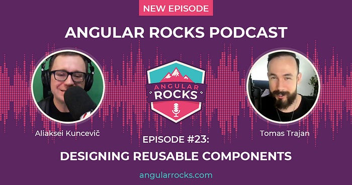
UPDATE (10.08.2021) — Check out Angular Rocks podcast where Aliaksei Kuncevič and I discuss topics presented in this article!
The Experience
The ideas presented in this article are based on extensive experience from a large enterprise environment (150 Angular SPAs and 30+ libs ) — many of which consume our custom Angular component library!
🤫 Wanna know how we can manage such a large environment without our heads going 🤯
Check out Omniboard, the best tool for lead software engineers and architects that helps them to get an overview to drive change by querying and tracking all their code bases! 🛠
ps: I made it using Angular / Material & NgRx and it served as an inspiration for many of the articles you have read already 😉
☕☕☕☕☕: This article is going to be one of the longer ones so do not hesitate to jump straight to the section which interests you the most based on the issues you’re currently working on!
Table of Content
- Have a Plan & Definitely Have a Design System
- The Isolation of the Sub-Entries and All The Benefits it Brings!
- Complex Data is Always Passed in the Template Never Through @Input-s
- Translation Library Independence
- State Management Solution Independence
- Epic Showcase for Great Developer Experience
Have a Plan & Definitely Have a Design System
As with everything we do, we usually achieve better results when we’re prepared, at least a bit prepared, please! 😅
But then, the life happens, schedules are never perfect and we usually need to be flexible and deliver anyway…
That being said, it is of utmost importance to have a system, especially a design system when taking upon a task of creating a custom component framework for your enterprise organization!
As experienced Angular developers, we’re already most likely considering all the relevant things from module structure, through nice clean one way dependency graph to its impact on treeshake-ability, bundle size and performance but we often forget about STYLES!
We should always approach styling with the same level of seriousness and rigor as our overall library architecture!
Let’s get more hands on with a couple of examples to get a better idea of what this will mean in practice…
Component variants
It is pretty common that we start with a single button, card, checkbox… But as the time passes by, the UX designers realize that we need to introduce progressively more variants of these to be able to express desired flows as they envisioned.
For example, let’s imagine we start with two basic cards; raised and flat…

But then, two weeks after, we get a new use case which calls for a flat card on a grey background… How do we solve that? What about…

As the times go by, we might need to introduce some color variations. Maybe we need to differentiate some business flow with a new color…
Most likely, it’s already clear where this is going… Introducing the brand new…

Ouch, this got out of hand pretty quickly, let’s take a step back and look what we have on our hands till this moment…
- my-org-raised-card
- my-org-flat card
- my-org-flat-card has-border
- my-org-flat-card has-border is-secondary
Now what about additional colors and combinations… What about multiple people (or even teams) introducing similar, but unfortunately never the same, additional modifiers for all the other components at the same time?
Houston, we have problem and its a very messy problem!
Wouldn't it be better if we had a system (or a framework) which would be able to express all the necessary variations from the start?
What we get with such system is a well defined “option space” where every possible variation of a component is known from the get go!
Option Space
Let’s imagine an example of such a system, for example, we can work with two dimensions:
- component type — eg primary, secondary and tertiary
- component theme — eg default, grey, blue, …
If we used them to create 3 x 3 table, we would see all the possible variations of given component!
This is very valuable even in case we do not plan to implement all of the variants right now (or even never)…
One of the best things about this approach is that it is extendable! We can easily keep adding additional types, themes or even whole dimensions! We will still end up inside of the system!
Let’s check out an example of how this could look like in practice…

Now, how to implement this from technical point of view depends on specific choices we made in our custom Angular component library.
For example, do we need need to support IE11 (even though it was deprecated in Angular 12 yaass! ❤️) so we can’t use css variables… Do we implement every component as an Angular only or do we also have css only components…
As we see, it all depends but the system is a must!
Follow me on Twitter because you will get notified about new Angular blog posts and other cool frontend stuff!😉
Next up, let’s get more technical with library architecture and especially, sub-entries!
The Isolation of Sub-Entries
The treeshake-ability of the library represents a key concern when building custom Angular component library!
The library will be used for developing of a multitude of applications — be it internal or external — so it will have a performance impact for all those users, be it fellow employees or the customers!
Sub-entries are a way to make Angular library treeshake-able under all circumstances.
The out of the box treeshake-ability did in fact improve quite a lot with the advent of Angular IVY but there are still cases when sub-entries are necessary!
The in-depth dive is unfortunately out of scope for this article but worry not as I have your back anyway. The detailed step by step guide to implement Angular sub-entries was published earlier this year 😉
Besides the final bundle size of our consumers, the sub-entries will have a lot of positive impact on the architecture and implementation of the custom Angular component library itself, we’re going to get:
- guarantee that we’re not introducing circular dependencies (the build would fail)
- guarantee that we will have clean one way dependency graph between sub-entries themselves (prevent tangled ball of mud)
- guarantee that our consumers are bundling least amount of code possible
⚠️ Now, before we venture further, a small heads up is in place!
The following section will have an impact on the other two which comes after it so it’s pretty important!
Complex data is always passed in the template using content projection (and never through the @Input)
When developing Angular components we are always encountering this one common question…
How do we pass and receive data in a child component to render some layout?
And usually we will go with one of the two main options:
- pass in data structure through
@Inputand the child will then render it - use Angular content projection to pass simpler children into parent in the parent template
As always, there is no silver bullet and both approaches come with their own set of advantages and disadvantages, but as we will see, we’re going to get biased towards the second one as it has better overall properties for our use case of building re-usable component library!
Pass in a data structure

This first approach is chosen quite frequently because of a couple of advantages, at least from the perspective of the component library authors:
- component acts as a black box, we have full control about how the options will be rendered
- managing the state of internally rendered DOM is usually easier (for example highlighting an item in the list when selected or handling a click to select some item)
- we can provide a well defined Typescript interface to enforce that the correct data structure has been passed into the dropdown
This sounds pretty good, right? So what are the disadvantages of this approach?
Most applications need some sort of I18n / translation support and our approach forces our consumer to do one of the two sub-optimal things:
- consumers have to pre-translate all the strings before passing data into the dropdown
- dropdown will translate keys internally — this will couple the dropdown implementation to a particular translation library implementation (which will then be forced onto all the consumers), also providing additional context for the internal translation becomes increasingly difficult
- application may deal with more than one type of translations, for example we might need to translate business codes next to plain I18n
As we can see, our internal implementation of the example dropdown is growing more and more complex and the above list of concerns could be for sure extended by other use-cases I haven’t encountered yet…
Let’s explore the tradeoff profile of the second solution…
Pass data using Angular Content Projection

The first example looks innocent enough so it doesn’t really give away its full potential, so let’s dig deeper!

Let’s unpack what’s going on in the bit more busy example above:
- we’re iterating over array of products
*ngForto render dropdown options per project - content projection gives us flexibility to customize option item layout by projecting additional
<my-org-product-type>(so we do not have to keep introducing more and more flags to the parent dropdown to cover all the use cases) - consumers of the dropdown are free to use ANY pipe they wish, be it from I18n translation library or something totally custom
Our approach is obviously superior in terms of provided flexibility and developer experience from the point of view of the library consumers!
As we stated previously, everything comes with a cost and our approach is a bit more complicated to implement properly.
The backbone of our implementation will be the use of @ViewChildren in the dropdown itself to get hold of all the items to be able to handle the state and interaction.
This is further complicated by the fact that the items can be dynamically added and removed during the parent dropdown life time so we need a mechanism to re-register everything whenever they change…
Let me know in responses or on Twitter @tomastrajan if you would be interested in series about how to best implement each particular component!

🔑 The key takeaway here is that we’re prioritizing de-coupling of unrelated concepts and developer experience of the library consumers!
We do NOT want our dropdown to be aware of translations be it I18n or some other business pipe, more so we do not want it to be aware about the actual layout it is managing. Its only concern should be state and interaction of dropdown items!
Of course, the same principle can and should be applied also when implementing other components
Check out great article by Roman Sedov which gets into greater detail on how to do this in practice!
Translation Library Independence
The previous point can be then generalized into an approach which leads to a full translation library independence on the part of the Angular component library which is a desirable goal!
Some of the consumers in our organization may roll out custom translation implementation while others may reach for 3rd party solutions like ngx-translate, transloco or others…
To achieve such independence, we should always follow an approach that whenever we’re accepting some strings to be rendered by the library, it should be either direct template interpolation like <my-org-some-component>{{someProp | translate }}</my-org-some-component> or if we use @Input then it should be only for plain strings so then again, we can translate them using pipe like <my-org-some-component [label]="someLabel | translate"> .
Internal Translations
One question still stands, how do we manage translations of the text provided by the library itself? For example, things like a default placeholder or labels for various form input types like date picker names of days…
To handle this use case it would be the best to go with a simple private translation pipe to be used only by the library itself with some name like myOrgComponentsTranslationsInternal to prevent clashes with the consumer translation solutions.
We still have two options:
- pass language as a property to every component which needs it, eg
<my-org-datepicker [language]="de">— this would make the implementation simpler as we would not even need internal pipe, we could simple retrieve value from a plainTRANSLATIONS = { de: { 'some.key': 'Some translation '}}object, BUT the developer experience for consumers would be sub-optimal as they would need to provide language to every component that needs it - implement some internal pipe which injects
MyOrgLanguageService(provided by the component library) so that we can change language for all library components by callingsetLanguage('de')on that global service — this solution still allows us to have fully independent translations in the consumer application, the only thing application needs to do is to set language at the start and whenever it changes
State Management Solution Independence
In the similar way, we also do not want to force any particular state management approach in the consumer applications.
And luckily, the previously described solution receives data through the template which represents a great place to decouple sourcing of the data from its usage!
Things we should always keep in mind
- when implementing toast / notifications / global status popup — we should resist the urge to introduce global service and provide components instead, these components will then receive list of current messages to display and emit events based on interaction, the consumer apps (or higher level utility library) are going to handle these and integrate them with their own state management solution

- when implementing language selector — again we should resist expecting a specific state management solution even though it might be useful to have a global service as described in the previous point, the decoupled integration then can look something like this for plain Angular state management

… or the same using NgRx

🔑 The key takeaway here is that again that we’re prioritizing de-coupling and independence so that the consumer applications are free to do things their way!
Epic Showcase for great Developer Experience
And last but not least, we have to provide our consumers with a showcase with epic developer experience so they can get stuff done quickly and most important — without frustration — so they can deliver great applications for their users!
Every Angular custom component library showcase should have:
- examples how to use every implemented component including code examples, preferably the actual ones which are the example itself and even better with a support to copy it to the clipboard!

2. Simple menu with access to everything all the time, the search functionality can be a very nice bonus
PRO TIP: make your developers love you by auto navigating to a page if there is only one search match left 😉
Great, we have made it to the end! 🔥
I hope you enjoyed learning about the best practices and pro tips for building of your own custom enterprise grade Angular component libraries!
I would like to give special thanks to Kevin Kreuzer who is working with me on the project and was originator of many of these best practices! Go check out his articles and follow him on Twitter @kreuzercode!
Please support this guide with your 👏👏👏 to help it spread to a wider audience, it would be very appreciated 🙏.
If you work in a large enterprise organization with many teams and project then please don’t forget to check out Omniboard as it may really help you get an overview and drive change in your code bases and hence provide value for your organization and fellow colleagues!
Also, don’t hesitate to ping me if you have any questions using the article responses or Twitter DMs @tomastrajan.

Do you find the information in this article useful? — We are providing tailored expert support for developing of your Angular applications. Explore our wide range offers on angularexperts.ch
And never forget, future is bright

Wanna learn some Angular and you and your team are from Switzerland or surrounding countries? Check out the workshop offer!

If you made it this far, feel free to check out some of my other articles about Angular and frontend software development in general…


